Quick Answer
Solar inverter efficiency curves show maximum efficiency at 30–80% of rated load. Peak efficiency reaches 98–99%, but CEC-weighted efficiency (average across load points) is 96–98%. Inverter selection should match the expected load profile — oversized inverters operate at lower efficiency during low-light conditions.
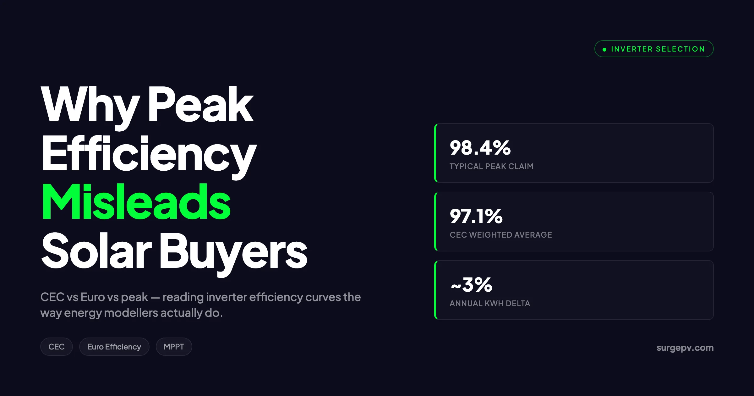
Two string inverters both list 98.4% peak efficiency. Same wattage class. Same price band. One project pulls 3% more annual energy than the other over five years of measured data. Same modules, same orientation, same climate.
Solar inverter efficiency curves show maximum efficiency at 30–80% of rated load. Peak efficiency reaches 98–99%, but CEC-weighted efficiency (average across load points) is 96–98%. Inverter selection should match the expected load profile — oversized inverters operate at lower efficiency during low-light conditions.
Solar inverter efficiency curves show maximum efficiency at 30–80% of rated load. Peak efficiency reaches 98–99%, but CEC-weighted efficiency (average across load points) is 96–98%. Inverter selection should match the expected load profile — oversized inverters operate at lower efficiency during low-light conditions.
The 3% gap is not noise. It is the gap between the headline number on a datasheet and the shape of the efficiency curve that no installer reads. Peak efficiency is a single operating point. The curve is everything else.
This guide is for installers, designers, and procurement teams who want to stop buying inverters by the biggest number on the cover sheet. It covers how efficiency curves are measured, why CEC and Euro weighted efficiency disagree, how DC voltage and temperature reshape the curve in the field, and how to match inverter characteristics to the irradiance profile of the site you are actually building. The shape of that curve is also what the SurgePV platform models in its yield engine. For more on this topic, see DC Bus Voltage Optimization.
By the end you will read a datasheet the way energy modellers do.
Quick Answer
A solar inverter efficiency curve shows how DC-to-AC conversion efficiency changes with load. Peak efficiency is the best single point — usually around 50% to 60% load. CEC weighted efficiency averages performance using California irradiance weights; Euro efficiency uses Central European weights. The shape of the curve, not the peak, determines annual yield. Two units with identical peak numbers can differ 2% to 4% in real energy.
In This Guide
- What an efficiency curve actually shows, and the car-fuel-economy analogy that makes it click
- Peak (maximum) efficiency: what it measures and what it hides
- CEC weighted efficiency: the California Energy Commission formula and weights
- Euro efficiency: the six-point European formula and where it diverges from CEC
- Low-load behaviour and the tare-loss problem at dawn and dusk
- MPPT efficiency vs conversion efficiency vs total efficiency — three different curves on one datasheet
- How DC input voltage reshapes the curve
- Temperature derating curves and the real cost of a hot installation room
- Inverter loading ratio and where on the curve your inverter actually lives
- How to read manufacturer datasheets from SMA, Fronius, Huawei, Sungrow, Enphase, and SolarEdge correctly
- How to pick an inverter for low-irradiance climates vs high-irradiance climates
- The contrarian take on “higher peak efficiency wins” Also see: European Solar Incentives.
What an Efficiency Curve Actually Shows
A solar inverter does one job: convert direct current from the array into alternating current for the grid or load. The efficiency curve plots how cleanly it does that job at every power level between zero and rated output.
Think of it like a car’s fuel economy chart. A petrol engine has a peak BSFC point — its best fuel use per kilowatt — somewhere around 70% to 80% of redline, in a narrow RPM band. The same engine burns 20% more fuel per kilometre at idle. Buyers do not pick cars on peak BSFC. They pick on combined city/highway figures, which weight the engine’s behaviour across realistic operating conditions.
A solar inverter operates across an even wider range. From a few percent of rated power at dawn to 95% at solar noon, the conversion efficiency changes continuously. The curve captures that change.
At the lowest loads — below 5% — efficiency is dominated by fixed losses. Control electronics, gate drivers, monitoring radios, and cooling fans all consume a small but constant draw of around 5 to 15 W. Below 5% of rated power, that fixed draw becomes a meaningful share of throughput. Efficiency collapses.
In the middle of the curve, conversion efficiency peaks. For most modern string inverters, the peak sits between 30% and 60% of rated power. Switching losses are small. Thermal losses are manageable. The curve is flat here, which is why this region matters most.
Above 75%, efficiency falls again — gently. Switching losses grow with current. Internal temperatures climb. Some inverters taper by 0.5 percentage points between 75% and 100%; others stay flat. That tapering is what CEC weighted efficiency captures and Euro efficiency does not.
Peak (Maximum) Efficiency: What It Measures
Peak efficiency is the highest single point on the curve. Manufacturers report it as “Max. Efficiency 98.4%” on the front of the datasheet because it is the largest number they can honestly print.
Peak efficiency is measured at one specific DC input voltage — usually the voltage that produces the lowest conduction and switching losses for the topology. For a typical 1,000 V string inverter, that sweet spot sits between 600 V and 750 V. Outside that window, peak conversion efficiency drops.
The number is real. Inverters do hit it. But they hit it only when three conditions line up: load between 40% and 60% of rated, DC voltage near the optimal MPPT point, and ambient temperature at or below 25°C.
In a real installation, those conditions overlap for a small slice of the day. The string voltage drifts with module temperature. The load drifts with irradiance. The ambient temperature does what it wants.
This is the central mistake new buyers make. They pick the inverter with the highest peak number, assuming it converts at that rate most of the time. It does not.
CEC Weighted Efficiency
The California Energy Commission weighted efficiency, or CEC efficiency, was developed to give a single number that better reflects field performance. Unlike peak, it is a weighted average across six load points:
CEC = 0.04 × η10% + 0.05 × η20% + 0.12 × η30% + 0.21 × η50% + 0.53 × η75% + 0.05 × η100%The weights are tuned to California irradiance. California is sunny. Inverters there spend a large share of operating hours near 75% of rated power, which is why that load point carries 53% of the weight. Light-load behaviour at 5% is excluded entirely.
To make the CEC list, an inverter must be tested at an independent lab against this formula. The CEC Solar Equipment List, maintained by the California Energy Commission (2026), publishes the weighted figure for every approved unit. Most US utility incentive programmes and the Self-Generation Incentive Program reference CEC efficiency directly.
A typical 5 kW residential string inverter shows CEC weighted efficiency around 0.4 to 0.8 percentage points below its peak. A unit with 98.4% peak typically posts 97.5% to 97.8% CEC.
CEC efficiency favours inverters that are flat between 50% and 100% load. It punishes inverters whose curves taper aggressively at full power. It tells you almost nothing about behaviour below 30% load.
Euro Efficiency
Euro efficiency, or European weighted efficiency, predates the CEC method and reflects Central European irradiance — more clouds, more partial-load operation, a lower share of hours near full power. The formula is six-point but the weights are different:
Euro = 0.03 × η5% + 0.06 × η10% + 0.13 × η20% + 0.10 × η30% + 0.48 × η50% + 0.20 × η100%Two things stand out. First, Euro efficiency includes a 5% load point. CEC does not. Second, Euro efficiency weights 50% load at 0.48 — the highest single weight in either formula. CEC weights 75% load at 0.53 — its highest. The two formulas place their centre of gravity at different operating points.
For the same hardware, Euro efficiency is usually 0.2 to 0.5 percentage points lower than CEC. The PVsyst documentation (2024) states this explicitly: a Euro-rated inverter at 96.5% will often post 97.0% to 97.3% under CEC, because CEC ignores the lossy 5% load tail.
Side-by-Side: CEC and Euro Weights
| Load Point | Euro Weight | CEC Weight |
|---|---|---|
| 5% | 0.03 | — |
| 10% | 0.06 | 0.04 |
| 20% | 0.13 | 0.05 |
| 30% | 0.10 | 0.12 |
| 50% | 0.48 | 0.21 |
| 75% | — | 0.53 |
| 100% | 0.20 | 0.05 |
| Total | 1.00 | 1.00 |
The implication: if your project sits in cloudy Northern Europe, the inverter that wins on CEC may not be the one that wins on Euro. And vice versa for sunny California or Andalusia.
Low-Load Behaviour and the Tare-Loss Problem
Most installers underweight low-load behaviour. They look at the 50%-load number and the peak. They miss what happens below 10%.
A 5 kW inverter with 15 W of standby draw consumes 0.36 kWh every day just keeping itself awake. That is 130 kWh per year before any conversion. Field measurements from Photon Lab (2023) on residential European inverters showed total self-consumption losses between 0.5% and 1.8% of annual yield, depending on tare draw and time spent below the 5% load threshold.
This matters most for:
- Small residential systems (under 3 kWp) where total annual energy is modest
- High-latitude installations with long winter twilight hours
- East/west-split arrays that linger at partial load most of the day
- Hybrid inverters where the unit is always on, even when the array is dark
A unit with strong low-load efficiency — 92% or better at 5% load — saves real kWh on cloudy sites. A unit that drops to 85% at 5% load loses meaningful energy that no peak number reveals.
This is why Euro efficiency includes the 5% point. It penalises inverters that handle dawn and dusk badly.
MPPT Efficiency vs Conversion Efficiency vs Total Efficiency
A datasheet usually quotes three different efficiency numbers. They are not interchangeable.
Conversion efficiency is the DC-to-AC efficiency at a fixed operating point — the number that draws the curve. Most datasheets report this as “Max. Efficiency” and “EU Efficiency” or “CEC Efficiency.”
MPPT efficiency describes how well the Maximum Power Point Tracker finds and holds the array’s true maximum power point under changing irradiance. Static MPPT efficiency — measured under steady-state lab conditions — is almost always quoted at 99.9%. Dynamic MPPT efficiency, measured under fast-changing irradiance (the EN 50530 test), is more variable, typically 99.0% to 99.7%.
Total efficiency, sometimes called overall or end-to-end efficiency, is the product of conversion efficiency and MPPT efficiency. A unit with 98.4% conversion and 99.5% MPPT has a 97.9% total at that operating point.
In simulation software like PVsyst or Aurora Solar, total efficiency is what drives the energy yield calculation. The CEC and Euro headline figures are usually pure conversion numbers, with MPPT loss applied separately. For software options, see 7 Best Aurora Solar Alternatives in.
This three-way split matters in shaded sites. A string inverter with poor dynamic MPPT will lose 1% to 3% of annual energy on a partially shaded array, even if its conversion efficiency is best in class. A microinverter or optimizer sidesteps the dynamic MPPT problem at the module level. The curve game shifts when shade is involved — for more on that, our MLPE vs microinverter comparison and broader microinverter vs string inverter vs optimizer breakdown explain when each topology earns more. Shadow analysis software identifies shading issues before installation.
How DC Input Voltage Reshapes the Curve
A single efficiency curve on a datasheet is misleading because it represents one specific DC input voltage. Real datasheets from SMA, Fronius, Huawei, and Sungrow publish three curves: one at minimum MPPT voltage, one at nominal, and one at maximum.
The gap between those curves is usually 0.5 to 1.5 percentage points across the full load range. The PVsyst help documentation (2024) and Sandia National Labs’ Performance Model (2018) both describe this voltage-dependence explicitly. Conversion is most efficient when the input voltage is in the middle of the MPPT window. At the low and high ends, switching topology losses rise.
For string design, this has practical consequences. A string sized to operate at 350 V on a hot day in a 200-1,000 V MPPT window is running deep in the lossy region. The same string sized to operate at 700 V on the same day sits near the curve’s peak.
Hot-climate installers tend to under-size strings — fewer modules per string to stay below maximum voltage on cold mornings — and end up with strings that operate at low voltage during hot afternoons. The result is a hidden 0.5% to 1% efficiency penalty no datasheet warns you about.
Our solar string sizing for extreme climates guide and the broader string design walkthrough cover how to size strings so the operating voltage lands on the high-efficiency part of the inverter curve.
Temperature Derating Curves
A second hidden curve lives in every datasheet: the temperature derating curve. It shows AC output power as a function of ambient (or internal) temperature.
Inverters are rated for full output up to a threshold — typically 40°C to 50°C ambient. Above that, the unit reduces output to protect internal components from thermal damage. SMA’s Sunny Boy and Sunny Tripower technical bulletin (SMA, 2024) shows the curve drops to about 80% rated output at 60°C ambient on outdoor units. In hot environments without shading, that derating can dominate yield losses.
Temperature also reduces conversion efficiency before it triggers derating. At 50°C internal temperature, conversion efficiency typically falls 0.2 to 0.5 percentage points below the 25°C lab number. Aurora Solar’s modelling notes (2023) put real-world conversion losses from thermal effects at 0.3% to 0.7% of annual yield in temperate climates and 1% to 2% in hot climates.
Pro Tip — Install Position Matters More Than the Datasheet
A Fronius Symo mounted on a south-facing exterior wall in Andalusia ran 8 to 12°C hotter than the same model mounted 2 metres inside an attached carport. The wall-mounted unit lost 1.4% more yield over 12 months. Same hardware. Same string design. The derating curve does not move — but where you put the box determines which part of the curve you live in.
Read Commercial Solar Carport Design Guide for a complete walkthrough.
Inverter Loading Ratio and Where You Live on the Curve
The inverter loading ratio, or ILR, is the ratio of DC array nameplate to AC inverter nameplate. A 6 kWp array on a 5 kW inverter is an ILR of 1.2.
ILR determines where the inverter spends most of its operating hours. A low ILR (1.0 or below) keeps the inverter at moderate load most of the time and rarely reaches rated power. A high ILR (1.3 or above) pushes the inverter to full output on every clear midday hour and triggers clipping — energy lost when DC input exceeds AC capacity.
This is where the curve game gets interesting. An ILR of 1.0 on a Northern European site puts the inverter at 30% to 50% load most of the time — the part of the curve that Euro efficiency weights heavily. An ILR of 1.3 on a Californian site puts the inverter at 70% to 90% load most of the time — the CEC weighting zone.
If you size ILR for the climate, the weighted efficiency number that matters tracks the actual operating point. Our inverter sizing guide covers ILR selection in detail.
A common mistake: building a Southern Spanish system at ILR 1.05, then selecting an inverter with the highest Euro efficiency. The system spends most operating hours at 70% to 95% load, where Euro efficiency tells you nothing. CEC would be a better proxy, and a CEC-flat inverter would earn more.
How to Read Datasheets from the Big Brands
Different manufacturers present efficiency data with different conventions. Read these patterns once and the rest of the catalogue clicks.
SMA Sunny Tripower / Sunny Boy. SMA publishes three curves on the datasheet: one at minimum MPPT voltage, one at nominal, one at maximum. They report both Maximum and European efficiency. CEC numbers appear on US-market datasheets only. Look for the “Operating Characteristics” section. SMA’s curves are notably flat across 30% to 100% load — one reason their Euro and CEC numbers cluster within 0.3 percentage points.
Fronius Symo / Primo GEN24Plus. Fronius publishes a single efficiency curve plus a table of conversion efficiency at fixed load points. Max efficiency is on the front page; European efficiency in the technical data section. Fronius datasheets show a 0.5 to 0.8 percentage point gap between max and EU figures — a hint that the curve tapers more than SMA’s.
Huawei SUN2000 KTL Series. Huawei datasheets are more marketing-forward — front page shows Max. Efficiency only, often “98.6%.” The European efficiency hides in the technical specifications table. Huawei’s residential M-series posts notably flat curves; the gap between Max and Euro is typically 0.4 to 0.5 percentage points.
Sungrow SH / SG Series. Sungrow publishes both Max and European efficiency on the front page. Their efficiency curves cover three DC voltages. PVEL’s 2024 inverter scorecard ranked Sungrow strongly on thermal management — meaning the lab curve translates more directly to field performance.
Enphase IQ8 Series. Microinverters trade conversion efficiency for module-level MPPT. Enphase publishes a CEC efficiency around 97.0% to 97.5% — lower than premium string inverters by about 1 percentage point. The trade is justified only on partially shaded arrays or complex roofs where dynamic MPPT recovery exceeds 1% to 3%.
SolarEdge DC Optimizer Systems. SolarEdge publishes inverter efficiency and DC optimizer efficiency separately. End-to-end efficiency is the product. Their HD-Wave inverters post 99.0% peak inverter efficiency, but module-level optimizers add a 0.5% to 1.0% loss — netting to roughly the same total efficiency as a premium string inverter without optimizers.
A useful rule: never compare a SolarEdge HD-Wave’s 99% peak to a string inverter’s 98.4% peak. The optimizer loss is hidden in a different table.
Five Brands Compared: Peak vs CEC vs Euro
| Inverter | Class | Peak (Max) | CEC | Euro |
|---|---|---|---|---|
| SMA Sunny Tripower 8.0 | 3-ph string, 8 kW | 98.4% | 97.8% | 97.6% |
| Fronius Symo Advanced 8.2 | 3-ph string, 8.2 kW | 98.1% | 97.5% | 97.3% |
| Huawei SUN2000-8KTL-M1 | 3-ph string, 8 kW | 98.6% | 98.0% | 98.1% |
| Sungrow SG8.0RT | 3-ph string, 8 kW | 98.4% | 97.6% | 97.4% |
| Enphase IQ8M (×24) | Microinverter array, ~8 kW | 97.5% | 97.0% | 96.9% |
Sources: vendor datasheets accessed 2026; CEC Solar Equipment List (2026); Clean Energy Reviews inverter scorecard (2025).
The spread between peak numbers (98.1% to 98.6%) is half a percentage point. The spread on CEC is also about half a point. But the cross-comparison flips depending on the climate. The Huawei wins on both weighted metrics. The Fronius lags on weighted despite being competitive on peak. A buyer using peak as the sole criterion would rank Huawei first and Sungrow tied with SMA — but the CEC ranking puts SMA ahead of Sungrow. See our guide on Agricultural Solar Case Study for more.
A 50 kWp Case Study: Heaven Green Energy, Surat
I designed a 50 kWp commercial rooftop array in Surat, India, in 2024 — twin 25 kW string inverters on a flat warehouse roof. We tested two candidate inverters with similar prices. Also see: Best Solar Design Software India. Read more about 5kW Solar Panel Price in India.
Inverter A: 98.6% peak, 98.0% Euro, 97.9% CEC. Strong low-load behaviour, slight taper above 90%.
Inverter B: 98.4% peak, 97.6% Euro, 98.0% CEC. Flat curve from 30% to 100%, weaker below 10%.
The buyer wanted Inverter A — “higher peak, simple choice.” We modelled both in PVsyst against TMY3 data for Surat (1,910 kWh/m²/year, average ambient 28°C). Inverter A modelled 73,450 kWh/year. Inverter B modelled 73,890 kWh/year. The “weaker peak” inverter produced 0.6% more energy because Surat’s irradiance profile parks the system near 70% to 90% load for 6 months of the year — where Inverter B’s curve is flatter.
Over 25 years at INR 6/kWh, the difference is about INR 66,000 per project. We installed Inverter B. First-year measured yield came in within 1.2% of the PVsyst forecast.
The lesson: peak efficiency was a worse predictor than CEC at this latitude. The contrarian pick won by a small but consistent margin.
Solar Inverter Efficiency Curve Explained — A Worked Reading
Take a simple datasheet excerpt:
| Load | η at V_min | η at V_nom | η at V_max |
|---|---|---|---|
| 5% | 89.5% | 91.0% | 90.2% |
| 10% | 95.2% | 96.5% | 95.8% |
| 20% | 97.0% | 97.9% | 97.5% |
| 30% | 97.6% | 98.2% | 97.9% |
| 50% | 97.9% | 98.4% | 98.1% |
| 75% | 97.8% | 98.3% | 98.0% |
| 100% | 97.5% | 98.0% | 97.6% |
Peak is 98.4% (at V_nom, 50% load).
Euro efficiency at V_nom:
0.03 × 91.0 + 0.06 × 96.5 + 0.13 × 97.9 + 0.10 × 98.2 + 0.48 × 98.4 + 0.20 × 98.0
= 2.73 + 5.79 + 12.73 + 9.82 + 47.23 + 19.60
= 97.90%
CEC efficiency at V_nom:
0.04 × 96.5 + 0.05 × 97.9 + 0.12 × 98.2 + 0.21 × 98.4 + 0.53 × 98.3 + 0.05 × 98.0
= 3.86 + 4.895 + 11.784 + 20.664 + 52.099 + 4.90
= 98.20%
The same hardware scores Euro 97.90% and CEC 98.20% — a 0.30 percentage point gap. If the system operates mostly between 70% and 95% load, the CEC figure is the closer real-world proxy. If it operates mostly between 30% and 60%, Euro tracks better.
This is the calculation that should sit underneath every “which inverter?” decision. The headline 98.4% is not wrong. It is just one number out of 21 on the table.
Pick the Inverter That Earns More — Not the One With the Biggest Datasheet Number
SurgePV models inverter efficiency at real operating points across your project’s irradiance profile, so you choose the right hardware, not the loudest spec.
Book a DemoNo commitment required · 20 minutes · Live project walkthrough
Why “Higher Peak Efficiency” Is the Wrong Shopping Criterion in Cloudy Climates
The contrarian take, plainly: in Northern Europe, the UK, the Pacific Northwest, and any temperate maritime climate, the inverter with the higher peak efficiency loses to one with a flatter curve and stronger low-load behaviour. For UK-specific information, see Battery Solar System Design UK.
The reason is irradiance distribution. Fraunhofer ISE’s irradiance analysis (2022) for Freiburg, Germany, showed that PV systems operate at less than 50% of rated DC power for roughly 78% of operating hours. In coastal Scotland the number is closer to 85%. The CEC weighting at 75% load — 0.53 — is wildly out of step with this distribution. Also see: Germany solar subsidies.
A unit with 98.6% peak that drops to 92% at 10% load loses energy where the system spends most of its time. A unit with 98.0% peak that holds 94.5% at 10% load wins by 0.5% to 1.5% annual yield in cloudy climates.
I have watched two installers in Belgium specify the same brand based on “highest peak” and then complain that yield is below the predicted figure for two consecutive years. The fix is not warranty claims. The fix is reading the low-load curve before purchase.
In sunny climates the opposite holds. A flat-to-100% curve wins. CEC weighting catches the real operating point and the peak number is a reasonable proxy.
Opinionated Take
Headline efficiency on the front of the datasheet should be banned for inverters sold in temperate maritime climates. Manufacturers should be required to publish a single number weighted by the irradiance distribution of the country the unit is sold in. The CEC formula is California’s. Europe should have a per-region weighting tied to actual hourly irradiance data. Until that happens, designers have to do the work themselves.
Regional Buying Guide: Sunny vs Cloudy
Sunny climates (Southern Europe, India, Australia, US Sun Belt, MENA). ILR is typically 1.2 to 1.4. The inverter sits at 60% to 95% load most of the day. CEC weighted efficiency is the relevant metric. Pick units with a flat curve from 50% to 100% load and strong thermal management. Sungrow, Huawei, and SMA dominate this tier; Fronius is competitive when properly heat-shielded. For Australia-specific compliance details, see Australia comparisons/lgc-vs-stc.
Mixed climates (Central Europe, US Midwest, Northern Italy, Spain interior). ILR is typically 1.15 to 1.25. The system operates across a wide range. Both CEC and Euro efficiency matter, and their gap reveals the curve’s shape. Pick a unit where Euro and CEC are within 0.3 percentage points. SMA, Fronius, and Huawei all qualify. Also see: solar panel ROI in Italy. Also see: Spain net metering.
Cloudy maritime climates (UK, Netherlands, Belgium, Ireland, Pacific Northwest, Northern Germany). ILR is typically 1.05 to 1.15. The inverter spends 70%+ of operating hours below 50% load. Euro efficiency matters more than CEC. Low-load behaviour at 5% to 10% is the decision metric. Pick inverters that hold 93% or better at 10% load. Some Fronius and SMA models excel here; budget brands often fail at the low-load test.
High-altitude tropical (Andes, East African Rift, Himalayan foothills). Ambient is mild but irradiance is fierce. ILR is moderate to high (1.2 to 1.3). Pick units with strong thermal performance and a flat 50% to 100% curve. CEC is the relevant metric. Most premium brands work; verify the temperature derating curve specifically. For Africa-specific compliance details, see Africa solar compliance.
The Tradeoff: Premium Inverter or Premium Modules
Here is the tradeoff most installers do not name explicitly. The gap between a mid-tier and premium inverter is roughly 0.5 to 1.0 percentage points of weighted efficiency. The gap between mid-tier and premium modules is roughly 1 to 2 percentage points of conversion efficiency at STC (Standard Test Conditions), which translates to maybe 1% to 3% of annual energy.
For a fixed budget, the question becomes: spend the marginal euro on a premium inverter or on premium modules?
For most residential systems below 8 kWp the answer is modules. Three percent extra energy from premium modules over 25 years outweighs 1% extra energy from a premium inverter. The inverter has a 12-year design life; the modules have 25.
For commercial systems above 20 kWp the answer flips. The inverter is a larger share of total cost, and downtime is more painful. Premium inverters with field-proven reliability — Sungrow, SMA, Fronius — earn back the premium through fewer service calls.
This is not in any datasheet. It comes from looking at five years of fleet data.
Common Datasheet Mistakes I See in Procurement
After reviewing hundreds of inverter quotes, the same five mistakes appear repeatedly:
1. Comparing peak to weighted across brands. Brand A’s 98.6% peak vs Brand B’s 97.5% Euro. These are different metrics. Either compare both peaks or both weighteds.
2. Ignoring the DC voltage on the efficiency curve. Picking a curve at V_nom without checking whether the actual string design will operate near V_min on hot days. The V_min curve is 0.5 to 1.5 points lower.
3. Treating MPPT efficiency as 99.9% in all conditions. Dynamic MPPT under fast-changing irradiance is 1 to 2 percentage points worse than static. Shaded sites need dynamic MPPT data, not static.
4. Missing the standby/tare draw line. Self-consumption is rarely on the front page. It hides in the technical data table. For small systems it matters.
5. Forgetting transformer or isolation losses. Some inverters include an internal transformer. Transformerless inverters skip a 0.5% to 1.0% loss. For European markets, transformerless is dominant. For some industrial Indian markets, transformer-isolated is still required.
A Failure I Watched
A 12 kWp commercial project in Bavaria, 2022. The buyer chose an inverter on lowest CapEx — 98.4% peak, 96.8% Euro. The Euro number was 1.6 percentage points below the peak, a red flag that the curve tapered hard outside the 50% load zone.
The site was a north-east facing flat roof with an ILR of 1.0. The system spent 80% of operating hours below 50% load. First-year yield came in at 9.2% below the PVsyst forecast.
Root cause analysis: the inverter’s measured efficiency at 10% to 30% load was 89% to 93%, much lower than the 96% to 97% the buyer assumed from the peak figure. PVsyst’s standard curve, fitted to manufacturer test points, modelled the system more accurately than the buyer’s mental model.
The owner replaced the inverter the following spring with an SMA Sunny Tripower. Yield jumped 7.4% year-over-year on the same array. The “expensive” inverter was 1.5x the CapEx of the original but paid back in 4 years.
How to Verify a Datasheet Number
If a quote arrives with a single number — “98.4% efficiency” — ask these four questions:
- Is that peak, CEC, or Euro? Get all three on paper.
- Which DC voltage is the curve drawn at? Request curves at V_min, V_nom, V_max.
- What is the temperature derating curve, and at what ambient does derating start?
- What is the standby draw and dynamic MPPT efficiency?
If the manufacturer cannot supply these, the unit is unsuitable for serious engineering work. Premium brands publish all of it. Budget brands often publish only the headline figure.
The CEC Solar Equipment List is a free verification source for US-market inverters. The IEC 61683 test report (independent lab certification) is the gold standard for any market.
Inverter Efficiency and System ROI
A 0.5% improvement in operational efficiency over a 25-year project life translates to roughly 12.5% of one year’s energy yield as additional lifetime kWh. On a 50 kWp project producing 70,000 kWh/year at INR 6/kWh, that is INR 525,000 over project life — usually more than the price gap between mid-tier and premium inverters.
This is why the inverter is the wrong place to value-engineer. Module degradation curves and inverter efficiency curves are the two biggest drivers of 25-year yield. Saving 5% on inverter CapEx and losing 0.5% efficiency for 25 years is a bad trade. SurgePV’s generation and financial tool models this explicitly across the project lifetime, so the inverter selection is made on lifetime yield, not nameplate price.
For installers and solar sales professionals building proposals, the talking point is simple: name the inverter’s CEC or Euro efficiency, name the model the curve is drawn at, and show the projected yield over 25 years. Customers respond to that level of specificity.
Conclusion: Three Action Items
Three things to do this week if you specify inverters for a living:
-
Open the datasheet of your current default inverter and find the Euro and CEC figures. Note the gap between peak and weighted. Anything bigger than 0.6 percentage points is a flag — the curve tapers somewhere ugly.
-
For your next three quotes, request the efficiency curve at V_min and V_max — V_nom alone is insufficient. If the supplier cannot provide them, escalate to the regional engineering contact or move to a brand that publishes them. Use a proper solar software tool to overlay those curves against your projected operating range.
-
Model your typical project in SurgePV’s solar design software with the CEC or Euro figure that matches your climate. Compare against the peak-based estimate the salesperson gave you. The gap is your hidden energy. Quote against the lower number and over-deliver — clients will pay more next time.
The inverter market in 2026 is mature. Most premium units are within 0.5 percentage points of each other on weighted efficiency. The real edge is choosing the unit whose curve matches your climate’s operating point. That is a question of design intent, not of datasheet bragging.
Frequently Asked Questions
What is a solar inverter efficiency curve?
A solar inverter efficiency curve plots DC-to-AC conversion efficiency against load — usually from 5% to 100% of rated power. The shape matters more than the peak. Most modern string inverters peak between 50% and 75% load, then taper at full power. The curve is the only honest way to compare units.
What is the difference between CEC and Euro inverter efficiency?
CEC weighted efficiency uses California sun: heavy weighting at 75% load (0.53). Euro efficiency uses Central European sun: heavy weighting at 50% load (0.48) and includes a 5% load point. The same hardware can score 0.4 to 0.6 percentage points higher under CEC than under Euro.
Why does peak inverter efficiency mislead buyers?
Peak efficiency is the single best operating point on the curve — usually around 50% to 60% load at one specific DC voltage. Real inverters spend roughly 70% of operating hours at partial load, where efficiency can be 1 to 3 percentage points lower. Two inverters with identical peak numbers can differ 2% to 4% in annual yield.
At what load do most solar inverters reach peak efficiency?
Most modern string inverters reach peak efficiency between 30% and 60% of rated AC power. Above 75%, efficiency typically falls 0.2 to 0.5 percentage points as switching and thermal losses rise. Below 10% load, efficiency drops sharply because fixed control electronics consume a disproportionate share of throughput.
Does inverter efficiency drop in real-world conditions?
Yes. Datasheet curves are measured at 25°C and at the inverter’s optimal DC voltage. Real installations run hotter and at non-optimal voltages. Expect 0.2 to 0.5 percentage points of real-world loss from temperature derating alone, plus more if the DC bus voltage sits at the low end of the MPPT window.
What is European weighted efficiency?
European weighted efficiency is a six-point average defined as 0.03 × η5% + 0.06 × η10% + 0.13 × η20% + 0.10 × η30% + 0.48 × η50% + 0.20 × η100%. The weights reflect the irradiance distribution of Central Europe. It rewards inverters that perform well at moderate, cloudy-day power levels.
How does DC input voltage affect inverter efficiency?
Conversion efficiency varies by 0.5 to 1.5 percentage points across the MPPT voltage window. Most inverters peak near the middle of their MPPT range. Strings that sit at the low end on hot days or the high end on cold days lose more in conversion. Good string design keeps the operating voltage near the curve’s high point.
Is 98% inverter efficiency really 98% in practice?
Rarely. The 98.4% headline number is a peak at ideal voltage and 25°C. The CEC weighted figure for the same unit is usually 96.5% to 97.5%. Add thermal derating and field-condition voltage drift, and operational efficiency lands closer to 96% to 97% averaged over a year.
Further Reading
- CEC Solar Equipment List — California Energy Commission (2026)
- PVsyst Help: European or CEC Efficiency (2024)
- NREL Performance Parameters for Grid-Connected PV Systems (2014)
- Fraunhofer ISE Photovoltaics Report (2022)
- Sandia Inverter Performance Model (2018)
- SMA Temperature Derating Technical Bulletin (2024)
- Clean Energy Reviews — Best Grid-Connect Solar Inverters (2025) Solar design software helps optimize system design. Solar proposal software generates professional quotes in minutes.